The PARE brand kit.
The P mark, the wordmark, the colours and the type. Free to use when you write about PARE, list it, or build on it. Please keep the mark as it is.
01Logo
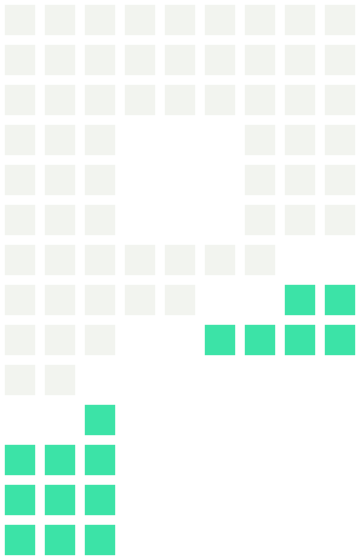
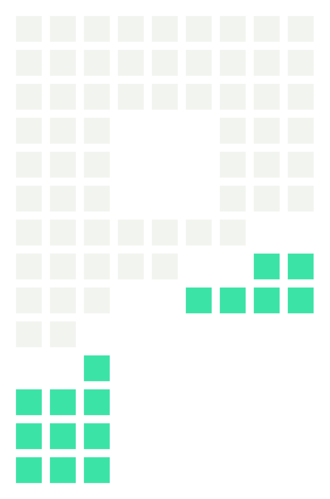
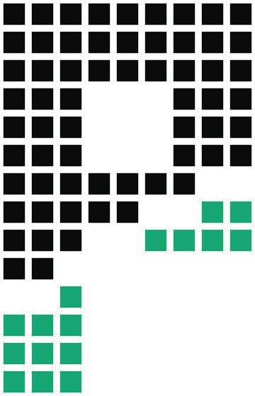

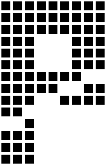


The mark is the P built from 78 blocks, with the green drip at the bottom. The SVGs are vector and scale to any size, and the PNGs have transparent backgrounds.
02Colour
Click a colour to copy its hex. There's one accent: green on near-black is the brand. Use the green for what matters, not for decoration.
03Type
All three are free under the SIL Open Font Licence.
04Usage
DO
- Leave clear space of at least three block-widths around the mark.
- Use the dark version on dark backgrounds and the light version on light ones.
- Use the one-colour mark when you can only print one colour.
- Write the name as PARE, in capitals.
DON'T
- Recolour the blocks, or swap the green drip for another colour.
- Stretch, rotate, outline or skew the mark.
- Add shadows, gradients or other effects.
- Put the mark on a busy photo without a solid panel behind it.
Press, listings or partnerships: @PareStocks on X.